Save 45% from first month.
Imagine what's possible when you use blocks.
Accelerate your development workflow with cloneable interface elements and components. The ultimate save timer resource.
Call to actionAccelerate your development workflow with cloneable interface elements and components. The ultimate save timer resource.
Call to actionAccelerate your development workflow with cloneable interface elements and components. The ultimate save timer resource.
Accelerate your development workflow with cloneable interface elements and components. The ultimate save timer resource.
Call to action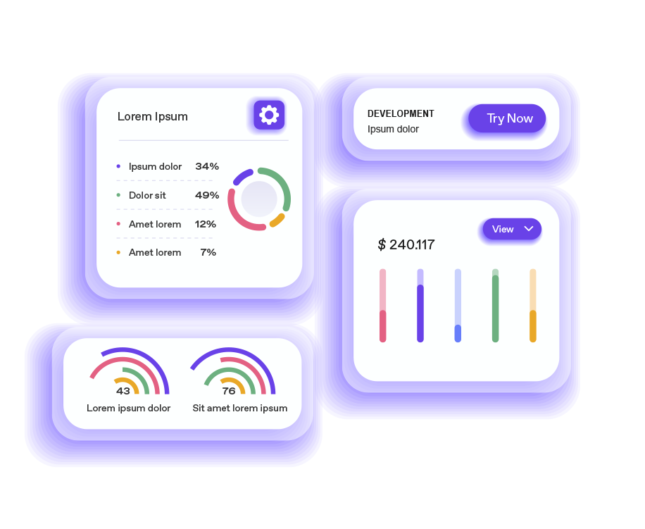


Delete this paragraph and pop something more exciting in here! Anything you like.
To display the tabs of this component, go to the Inspector Pane > Element Tree and click on the eye of the folders with the "tabcontent" class. You will see that the content is previewed on the canvas. Feel free to insert elements, as this works like a normal Div. These "tabcontainers" contain a specific ID, such as Home, About, News Gallery or Contact. This means that to change, for example, the background color, you have to go to the styles tab, and in Apply Styles, we will select the option "To this element id only", and then we will go to the design panel and change the background color .
As for changing the background color of the upper tabs, if we select the container with the name "tabslink", we will go to the upper element panel, and we will see that it has a Role :Button, and it has a "Data Event Onclick" value, the which we will click and a name and a value are displayed, well, we will change the hexadecimal color for the color that we want to put.
As for the size of the tab, just change the width and height values in the parent container.