
Code Featured Component Pack
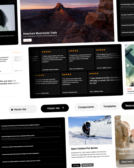
The Code Components page features a collection of 24 responsive, customizable elements designed to extend Site Designer with ready-made interactive layouts and visual effects. Available components include Hero Section Scroll FlyIn, Hero Sections Vertical Slider, Stack Navigation Buttons, Hover Button, Card Slider Counter, Brand Carrousel, Carrousel Gallery Cards, Product Card Magnification Lens, Progressive Blur Card, Vertical Photo Slider, Video Image Slider, Collapsibles, Customer Reviews Marquee, Typewriter Text Effect, Custom Cursor Follower, and Text Gradient Scroll.
These components provide reusable solutions for hero sections, navigation, sliders, product displays, collapsible content areas, testimonials, and animated text or cursor effects, helping designers quickly add modern functionality to their pages. Many of these components rely on special scripts to power their animations and interactive behaviors, so having a basic understanding of HTML, CSS, and JavaScript can be helpful when customizing or integrating them into your project.